The project's key objective was to redesign the law firm's website to help people find more information about the firm in no time and also to increase the client rate through the internet. I have worked on the UX and visual designs to make the website user-friendly, consistent, and easy to use.
Client
KTR Law Firm
Role
UX Designer
Duration
08 Weeks

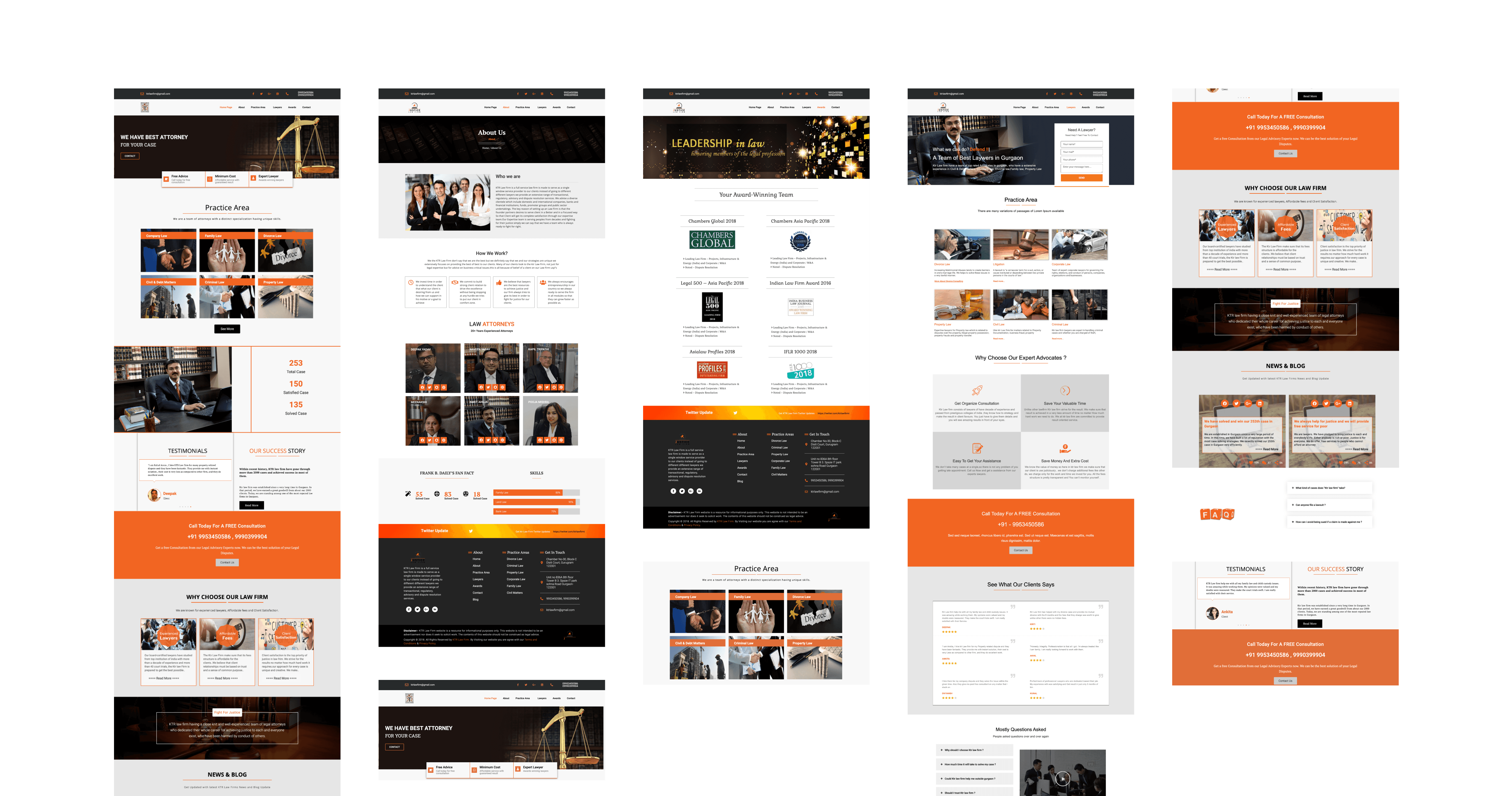
Previous website visuals
KTR has been using the same website for the last couple of years. Whenever they wanted to add additional information or pages, they just added them to the website, making the entire project appearance cluttery. Each component was designed differently, thus communication was ambiguous.
Research findings
I researched and got a lot of helpful information regarding legal services and how people may hire lawyers as well as what kind of information they might want to see on the website of lawyers or law firms. I gathered quantitative data from surveys and the internet and used it to create an entirely new visual experience for KTR's website.
What information on a law firm’s website matters most to consumers?

• More than 4 out of 5 participants (81%) in the study said that the years of experience a law firm had was important.
• 76% of participants said price/rates/free structure was important.
• Nearly 2/3 of participants (66%) said that past case result history would impact their decision.
• Only 26 out of 400 participants (less than 7%) listed social media activity as a top 5 factor for choosing a lawyer.
• Just 15% listed awards and memberships
What device do people use to research lawyers online?
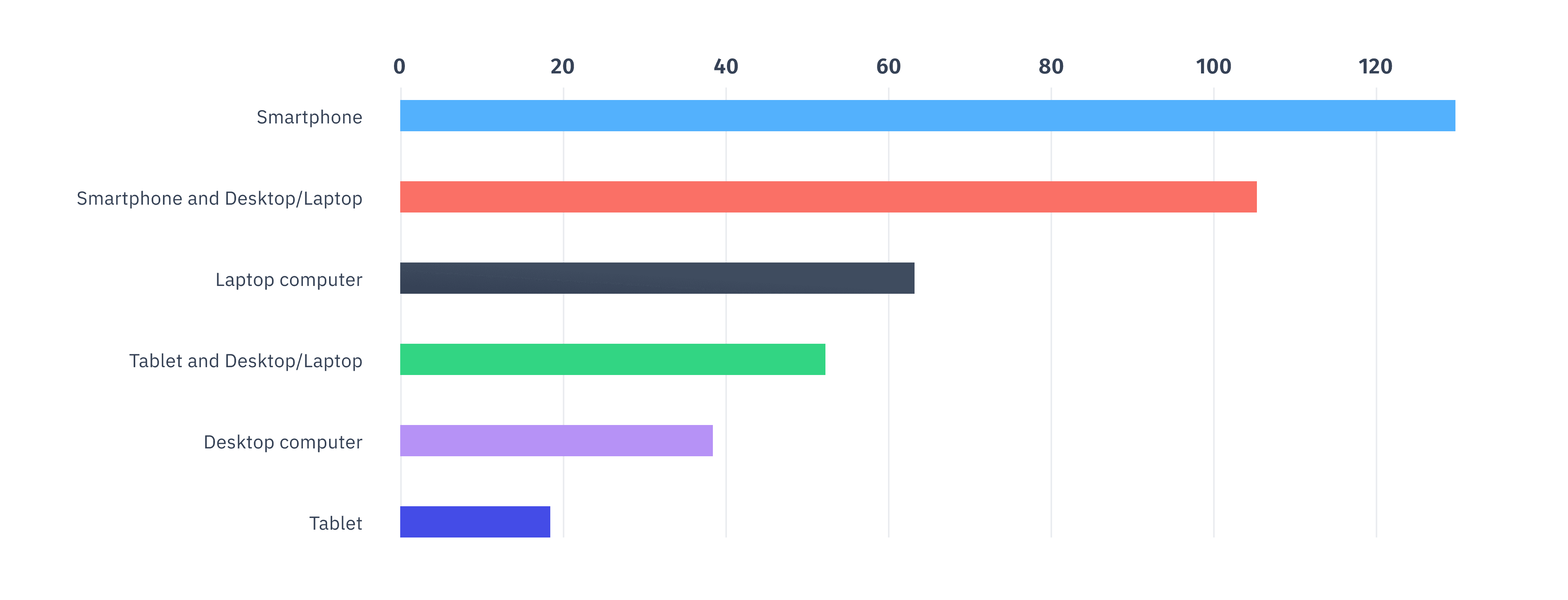
• 57% indicated that they would use a smartphone (iPhone, Samsung Galaxy, etc.) if searching online for a lawyer.
• 31% of participants said they would use only use a smartphone.
• 26% said they would use a combination of smartphone and laptop/desktop computer.
• 25% of those polled said they would only use a desktop/laptop computer.
The most important lesson here is to pay a lot of attention to how the website appears on smartphones. If the mobile experience is poor, drop-off rates will rise and the number of clients will fall.
Defining problems
KTR Law Firm's visual system was outdated, cluttered, and lacked excitement. It was difficult to understand the navigation system and their core offerings were not clearly emphasized. There were several faults in the previous website that reduced user involvement and, as a result, increased bounce-off rates. The following are the major issues that were addressed throughout this project.
• Less emphasis on main CTA and other critical information.
• Accessibility, usability, responsiveness of website on different screen sizes.
• Unnecessary webpages and unresponsive links.
• Messy layout and improper navigation through the website.
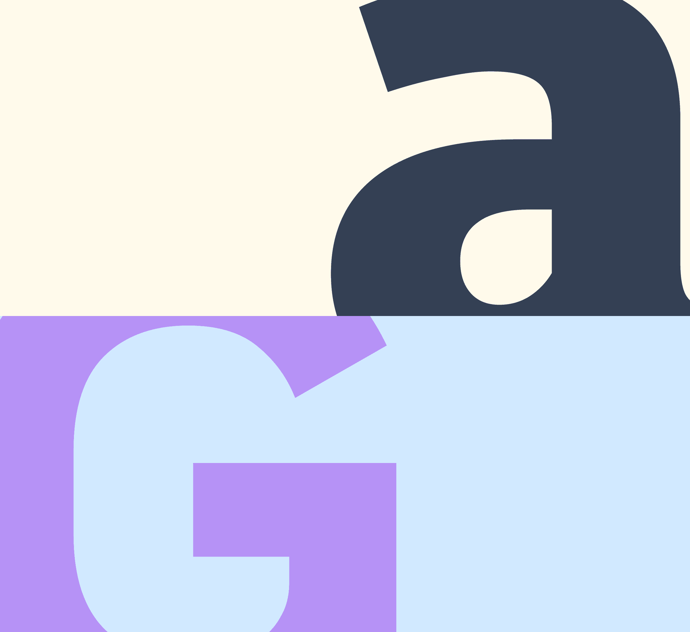
Visual language
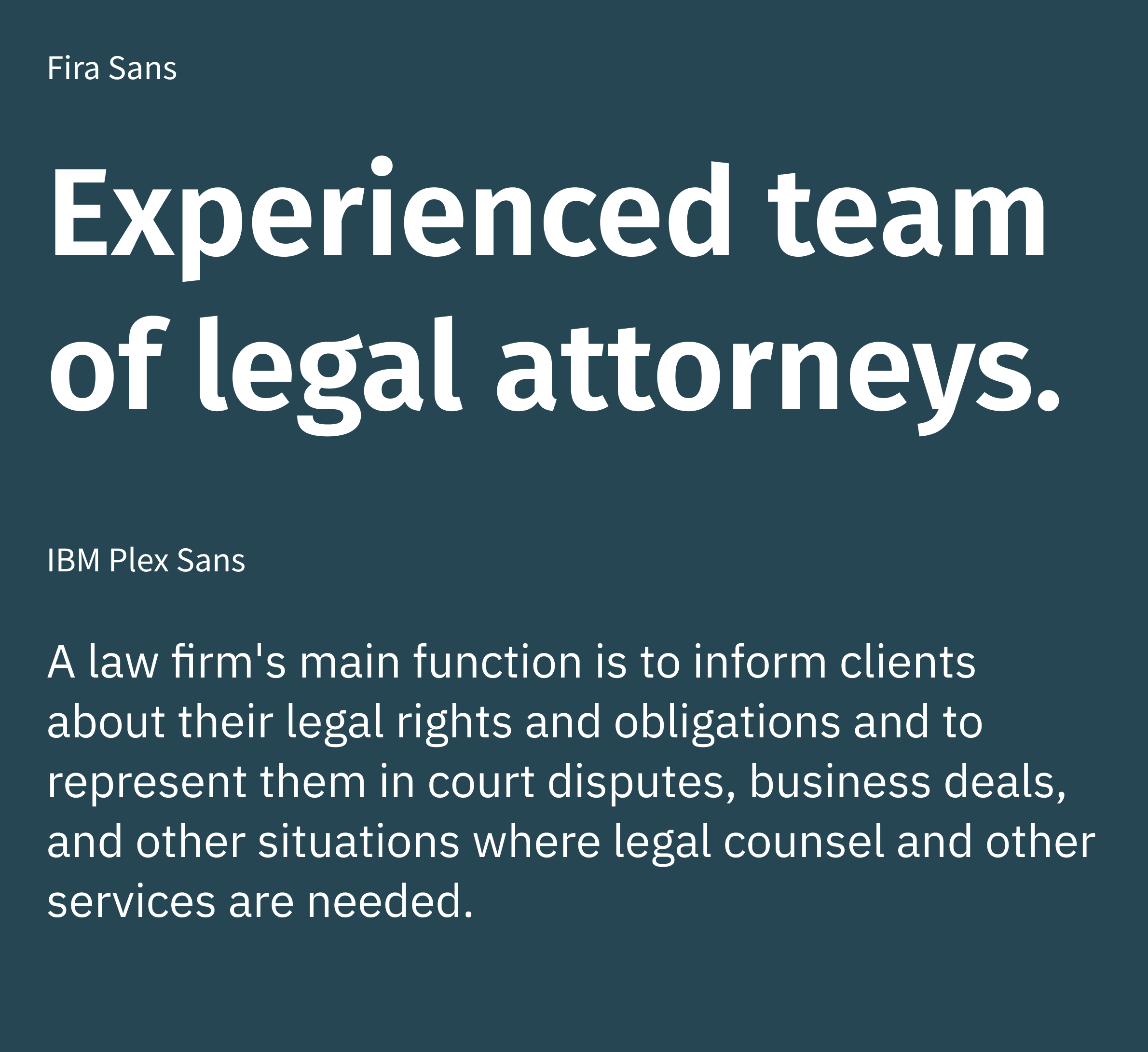
The project had no components at first, all they had was a logo and an outdated and messy website. I adapted the logo's design, developed a fresh color scheme, and generated a few site elements to be used in the process. I decided to use Fira Sans for the headers and IBM Plex Sans for the body and paragraphs.
Primary
Secondary
Neutral dark
Neutral light

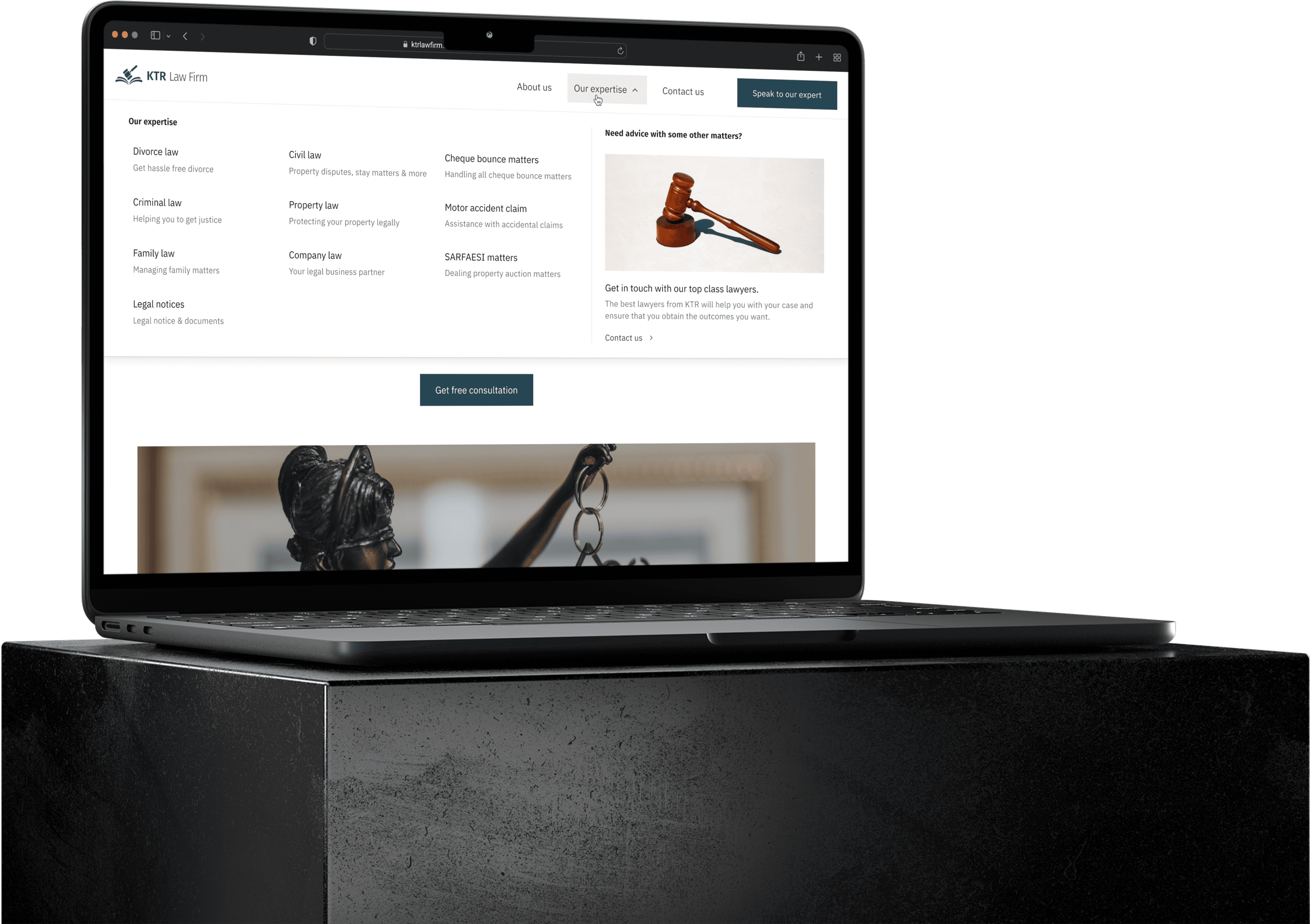
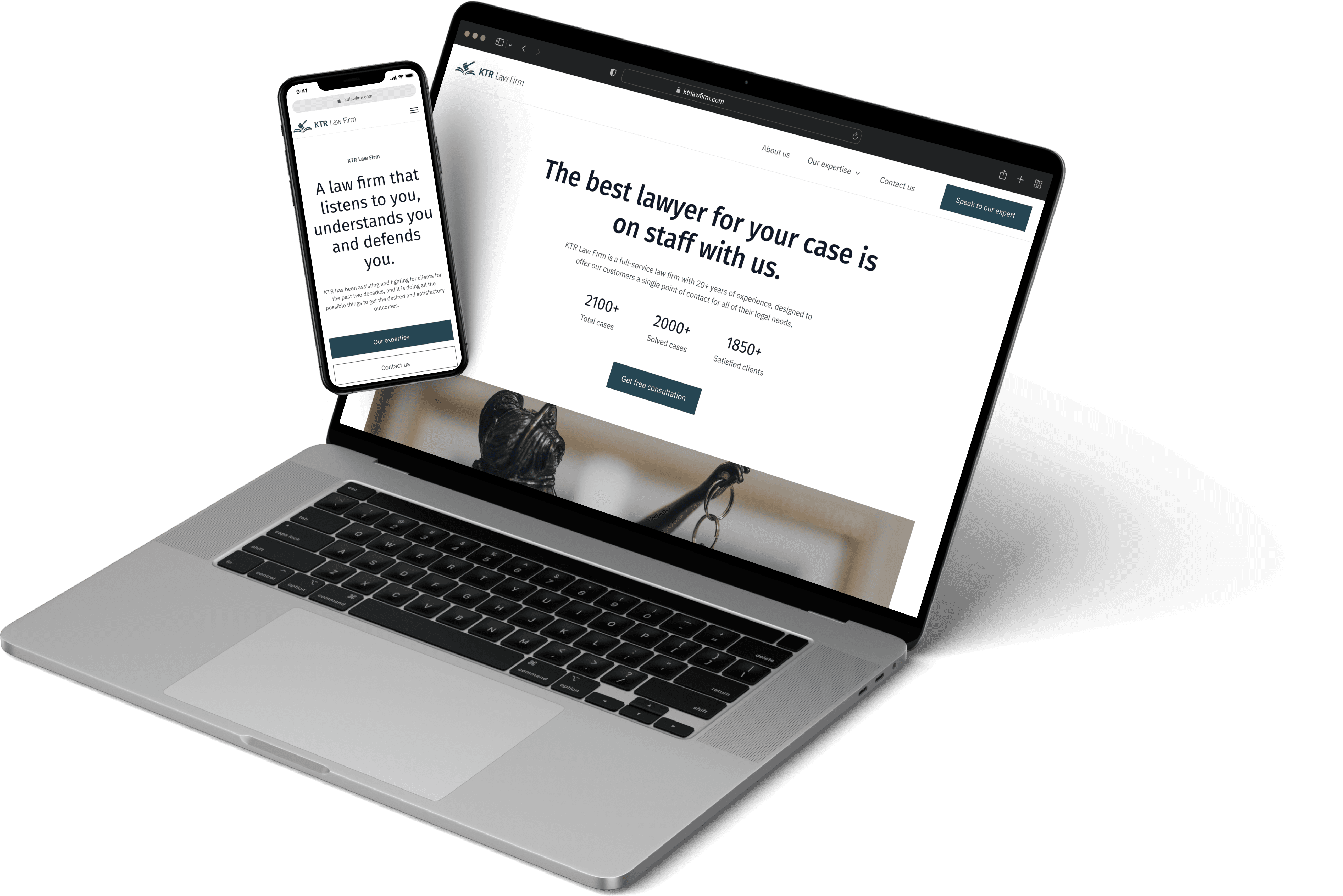
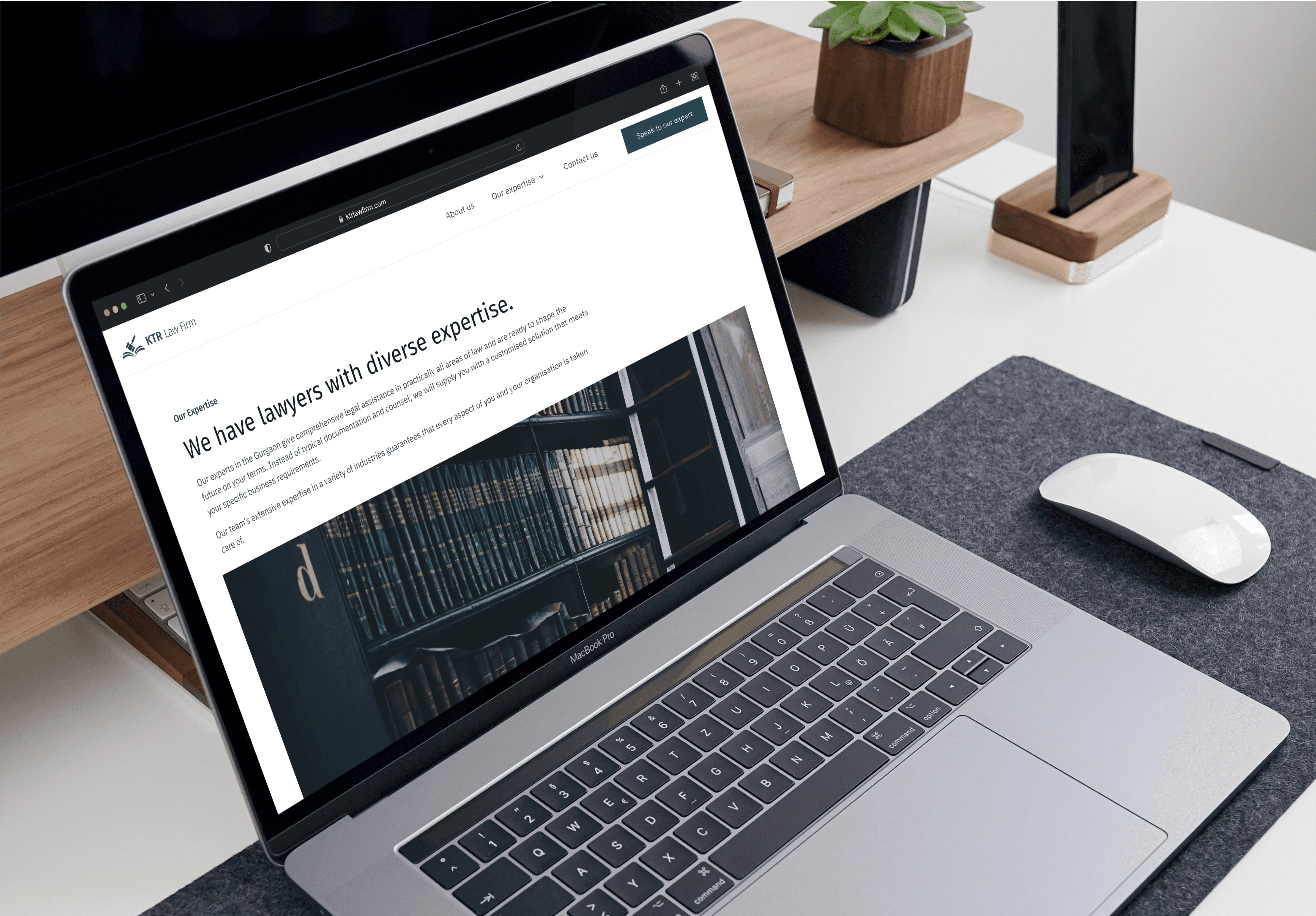
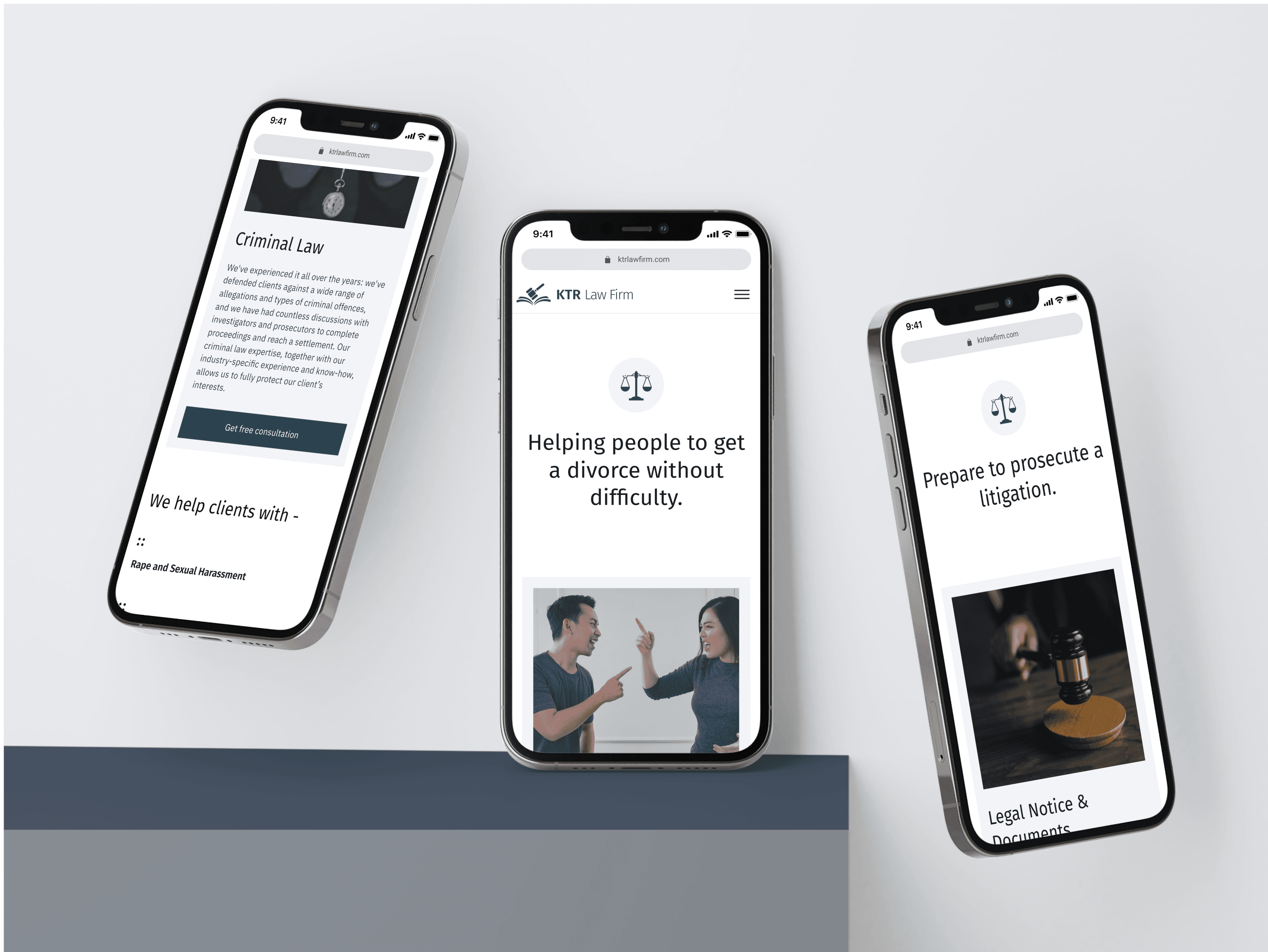
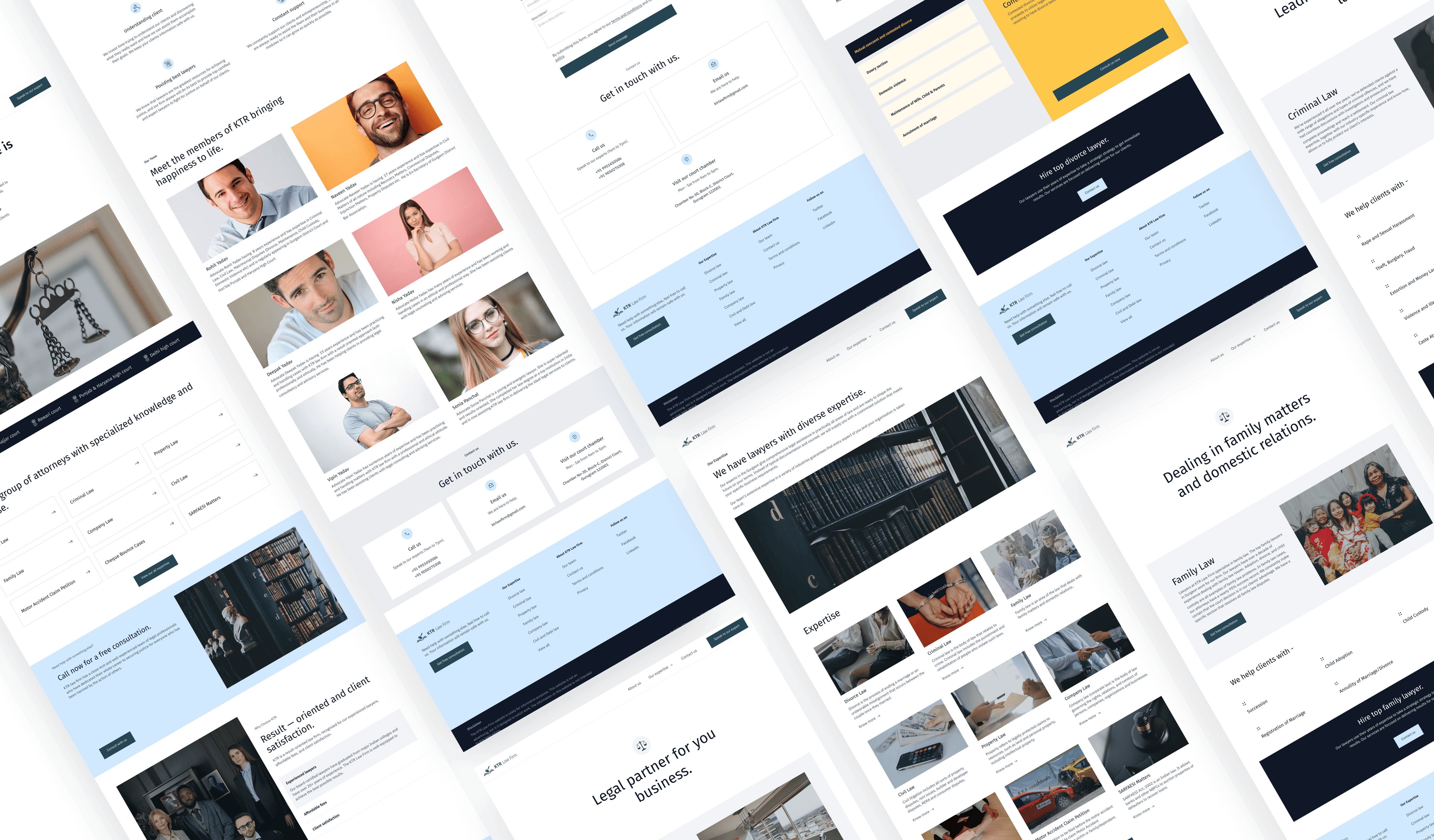
Final designs
I designed over 40+ screens with constant feedback from the KTR team.


Results
After many rounds of iterations and feedback, we came up with designs that give a feeling of clarity and purpose that is responsive across desktop, tablet, and mobile. Users may swiftly navigate between areas of the website using accessible navigation and several CTAs guide visitors to more relevant information. Watching a website I worked on becoming online is a great feeling.
Takeaways
🤝 Executing Design-to-Development Handoffs
Since this was my first freelance project, this project gave me valuable experience in handing off deliverables for development. I worked with developers to clarify component types and usage, ensuring that the design was pixel-perfect like it was in my Figma file in production. The style guide assisted the developers in rapidly understanding the components and developing the design.
🗒 Practice and Iterations Makes Perfect
During my time at KTR, I learned how to constantly improve the quality of my designs by collecting feedback from stakeholders via formal design reviews and briefings. I realized how important it is to maintain good communication, especially when asking clarifying questions to alleviate roadblocks and manage tight deadlines.