Designing and maintaining Midas Design System from zero to hero. The design system was intended to streamline design and development workflows, shorten start-to-finish deliverable times, standardize the use of reusable components and font styles, and incorporate standard base spacing units, font hierarchy increments, and other features into the workflows.
Company
Midas Fintech Solutions
Role
UX Designer
Timeline
2022 - Present
Status
In active use
The challenge
There was no collection of common design patterns or components and had broken typography when I first joined Midas. Developers were wasting time repeating the same work. They had to build specification for every element in the interface when it came to build.
The process
Developing designs without clear font styles, inconsistent component dimensions, and a defined color scheme can be challenging and lead to a lack of consistency in the user interface. Establishing a design system that includes standardized guidelines for these elements can help ensure that designs are cohesive, consistent, and easy to use.
I advocated the idea of establishing a design system, and how the design system can improve the consistency and effectiveness of our designs.
I established a clear and consistent process for creating our design system. This process involves determining our design principles, establishing our design language, creating design guidelines, and implementing and maintaining the design system.
In numbers
Interconnected components bringing design and development closer.
Documented topics to ensure consistency across all products.
Faster and outstanding results quicker and consistently.
Prioritizing visual language
The visual language of a design system plays a crucial role in creating a cohesive and consistent user experience. In our design system, visual language spans colors, typography, icons and elevations.
Vibrant and accessible color system
A custom color palette has been created to support the system. It’s a vibrant and accessible palette to enhance the user experience across all of the web products. The colors have also been defined for use in both light and dark themes.
Typography
Typography is an important aspect of design systems because it helps to establish hierarchy, create visual interest, and improve readability. In a design system, typography is typically defined as a set of rules for how text should be styled and formatted. These rules may include guidelines for font selection, font sizing, line spacing, and other typographic details.
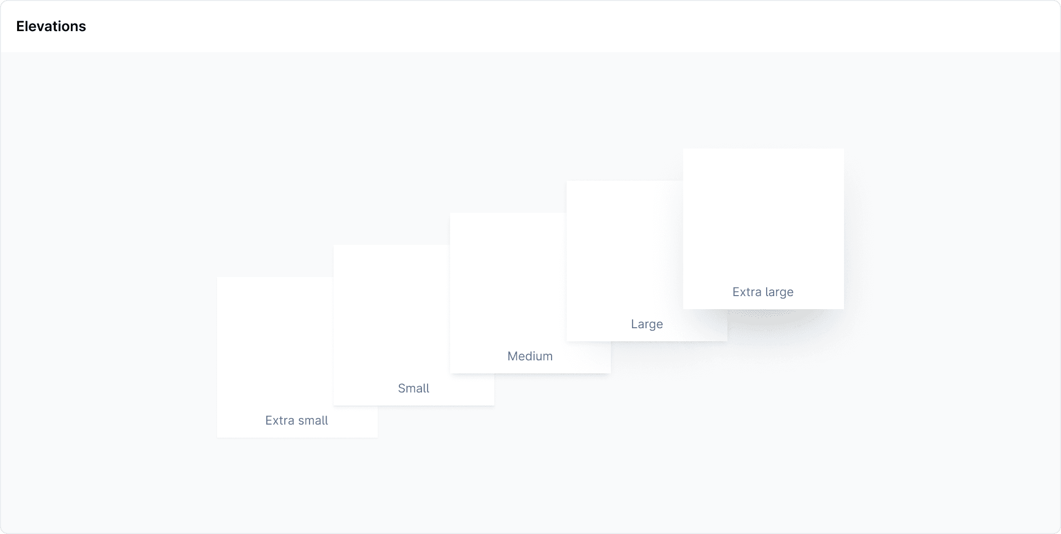
Elevation and Spacings
It is good to use an elevation system to differentiate surface overlap. Maintaining a consistent use of spacing in design helps to create a cohesive visual aesthetic across products. In Midas design system I've used a 8px spatial system.
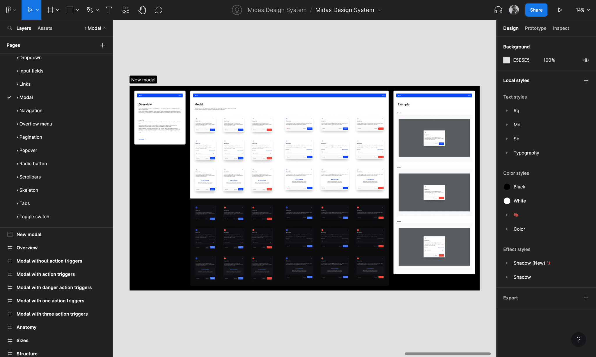
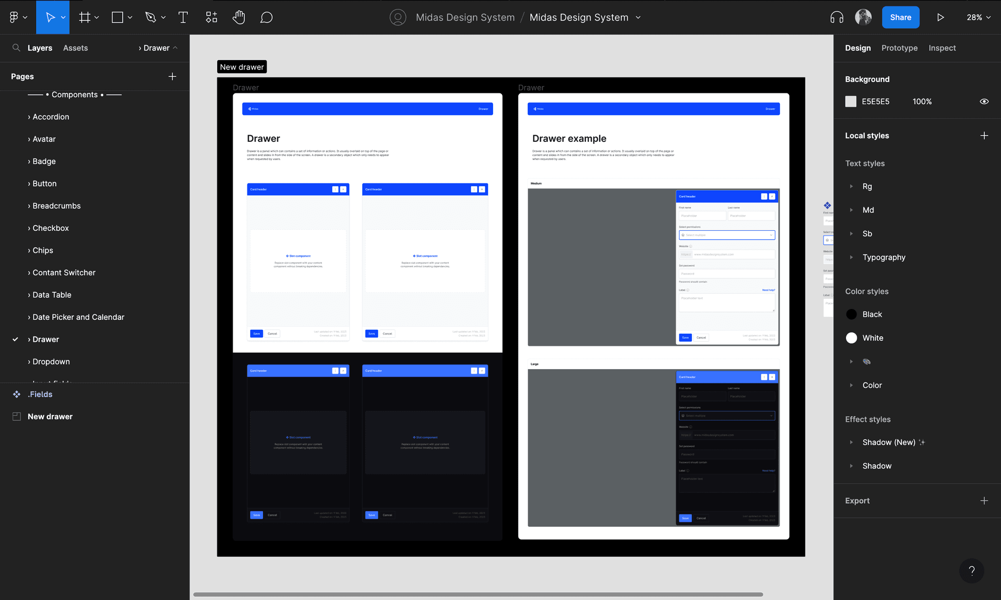
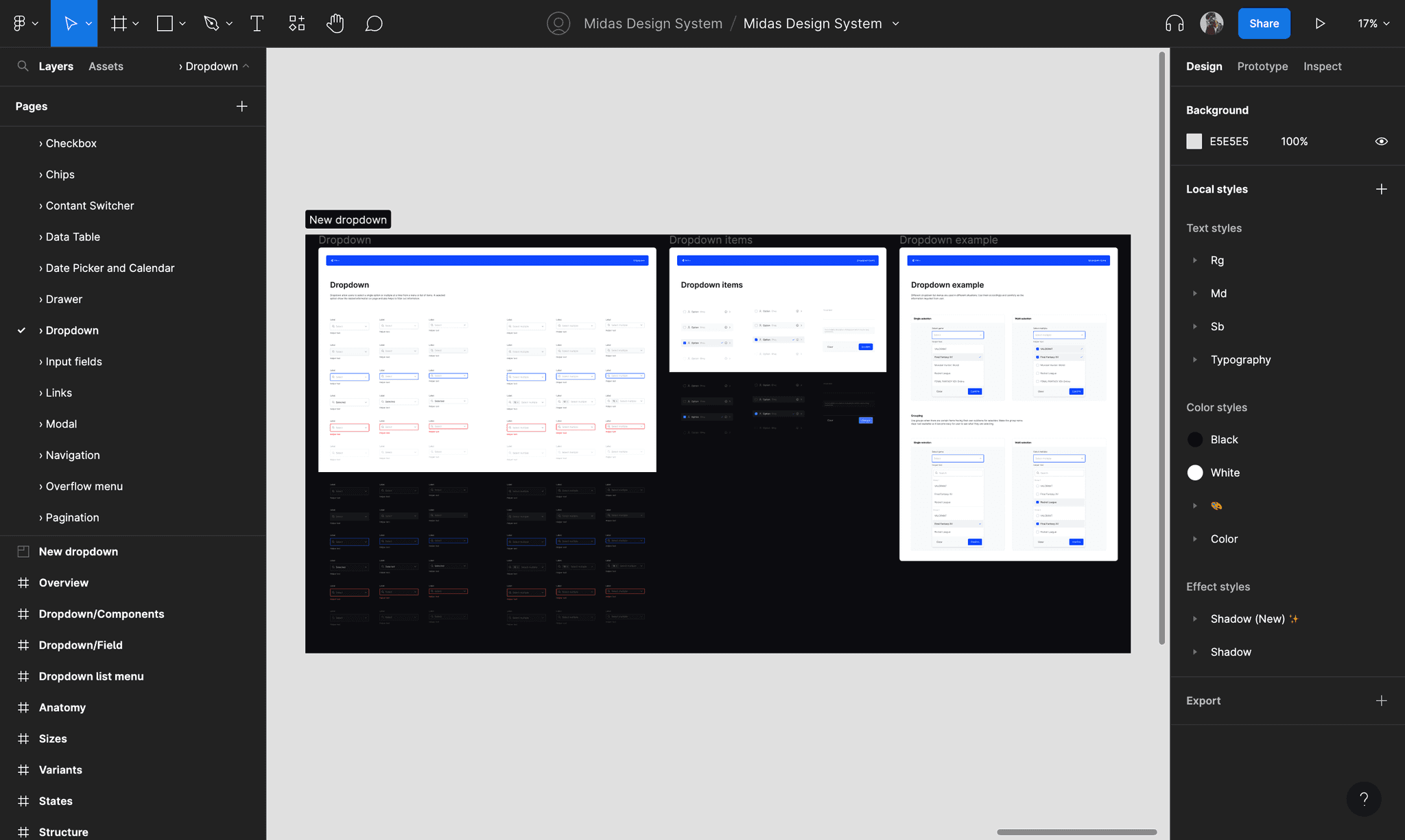
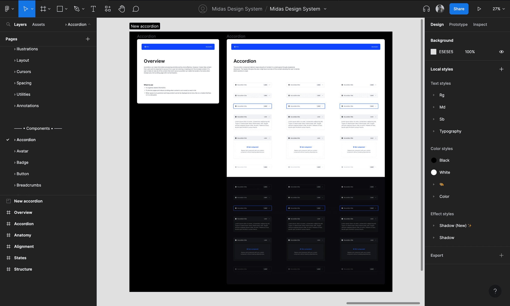
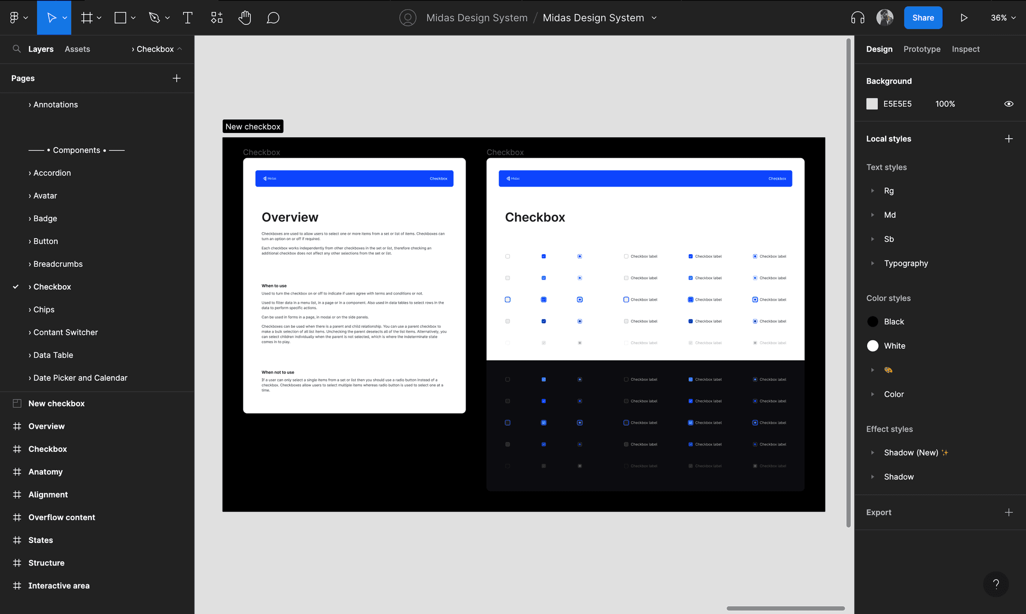
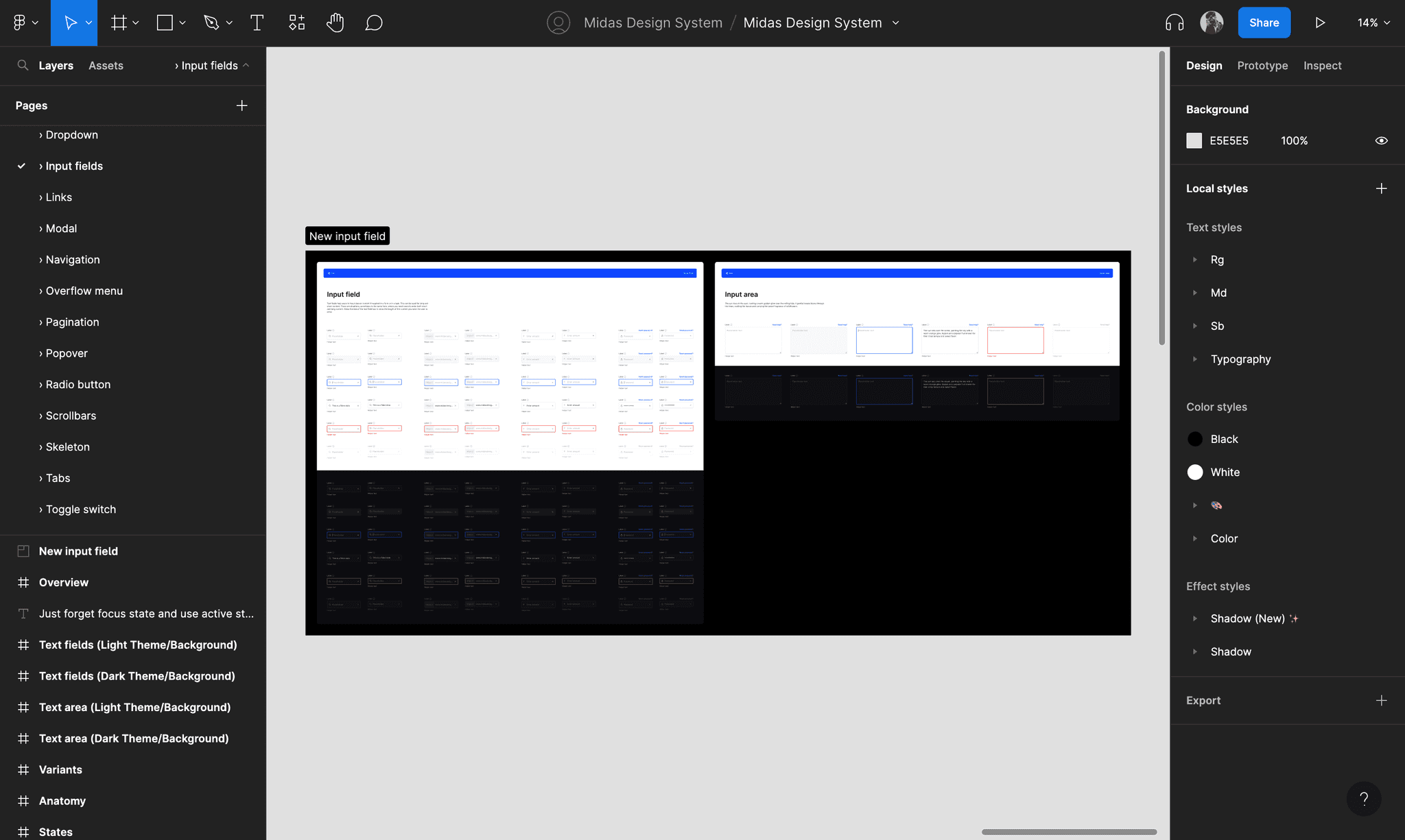
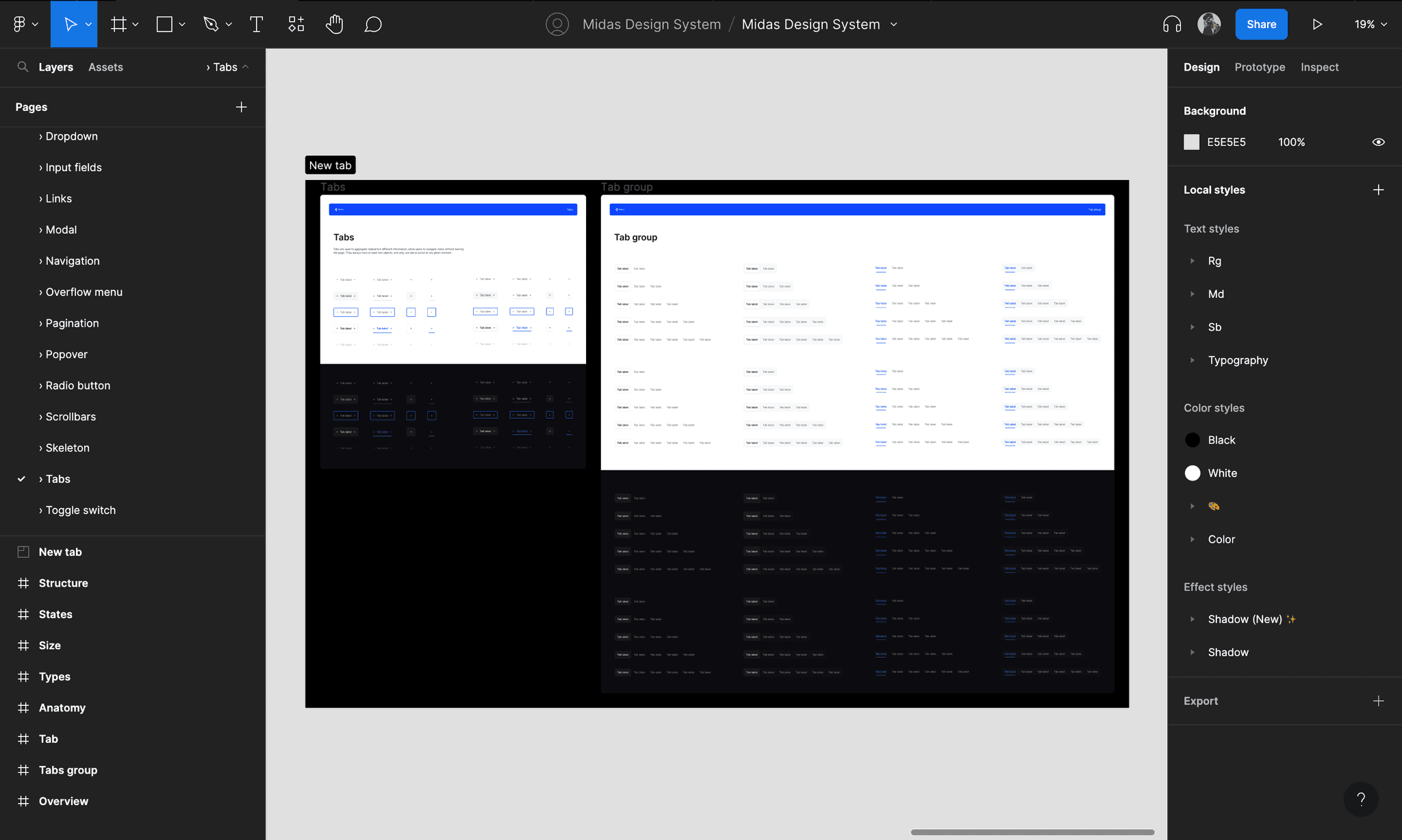
Design components and patterns
The next part was to extend the visual language to complete the design system, I needed to include a variety of essential elements such as buttons, dropdowns, inputs, and date pickers. I also included more specialized elements like modals, radio buttons, checkboxes, data tables, and pagination options.
Responsive design in Figma
While it’s simple to build responsive components, it’s not so simple to mockup designs responsively. It’s important to design web UIs that work at different browser widths. Fortunately, using a combination of settings and auto layouts you can create a basic responsive UI in Figma. It is powerful to see how the design works on different screens. All the elements in Midas design system are made to be responsive.
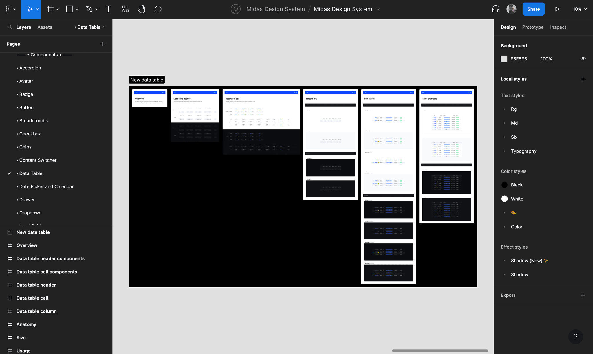
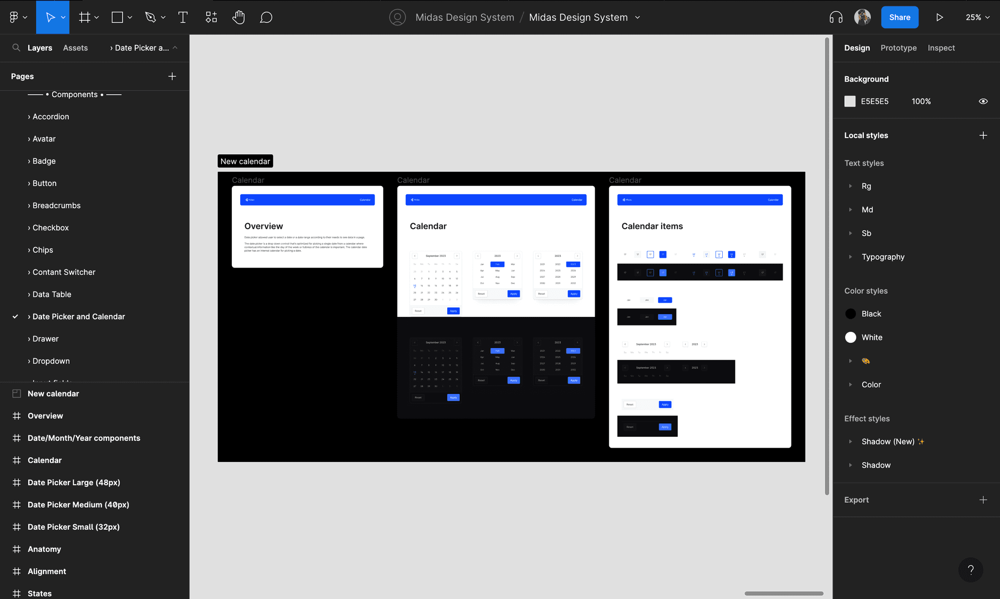
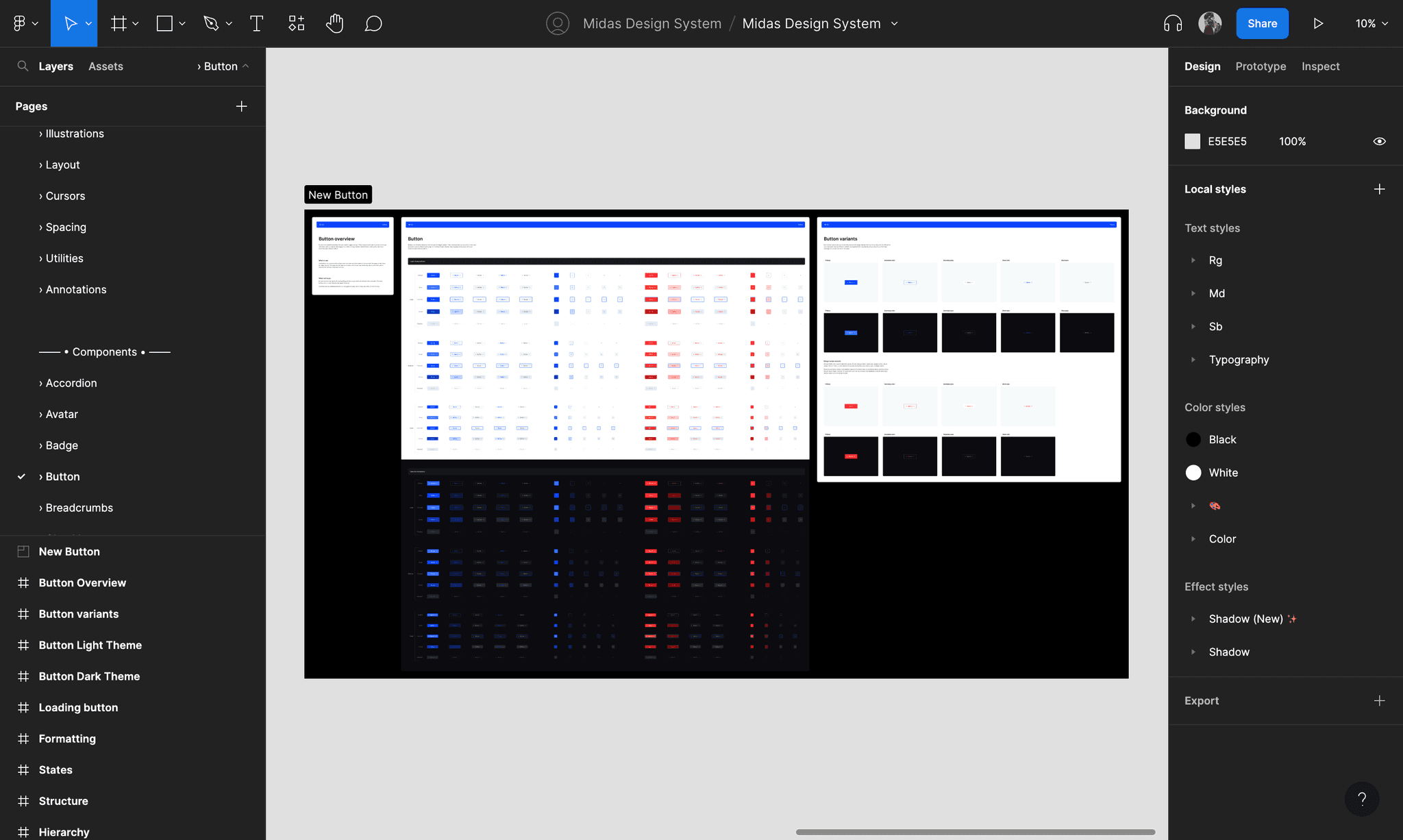
How does it look in Figma?
This is a quick tour of the Figma file containing all the patterns and components for the Midas design system.
Result & Final conclusion
Within the organization, utilization of the system increased design and development collaboration. It also served to improve efficiency in developing new tools, leading to a more cohesive, higher-quality user experience. The implementation of the Midas Design System has significantly accelerated the process of designing and developing products, made a huge impact on component usability, and potentially cut the time needed by up to 3 times.
Key learning & Next steps
• Design systems are only useful if they are actively maintained and easily consumed by everyone associated in the product's development.
• Developing a deep understanding of UI component interrelations and dependencies.
• How to effectively teach technical topics and tool to new people.
• Learned how to create accessible design systems that can be scaled at any level.
Managing and updating the Midas design system is a never-ending process. It is important to maintain robust and up-to-date documentation for design components in order to ensure that they are easily understood and accessible to everyone. Currently, we are documenting our components within Figma only, but this can be difficult to navigate and may not be fully accessible. We will be making the design system universal and migrating all the documentation to some other tool.